Plot Abundance-Occupancy Curve and Display the Core Taxa
Source:R/plot_abundance_occupancy.R
plot_abundance_occupancy.RdCreates a scatter plot showing the relationship between mean relative abundance and occupancy (occurrence frequency) of taxa, with core taxa highlighted.
Arguments
- core_result
A list object returned by
identify_core, containing at minimum:occupancy_abundance: A data frame with columnsotu,otu_rel(mean relative abundance), andotu_occ(occupancy).elbow_core: Character vector of OTU IDs identified as core using the "elbow" method.increase_core: Character vector of OTU IDs identified as core using the "increase" method.
- core_set
Character string specifying which core set to highlight. Must be either "elbow" or "increase" (Default elbow).
Value
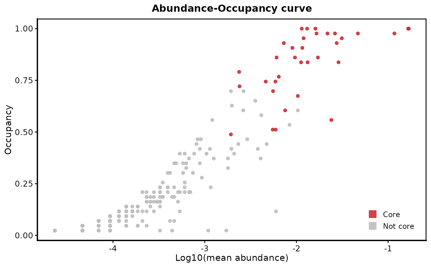
A ggplot object showing the abundance-occupancy plot with core taxa highlighted in red and non-core taxa in grey. The x-axis shows log10-transformed mean abundance and the y-axis shows occupancy (0-1).
Details
The function creates a scatter plot where each point represents a taxon (i.e. ASV or OTU). Core taxa (as defined by the selected method) are shown in red, while non-core taxa are shown in grey. The plot uses a log10 scale for abundance to better visualize the full range of abundances typically found in microbiome data.